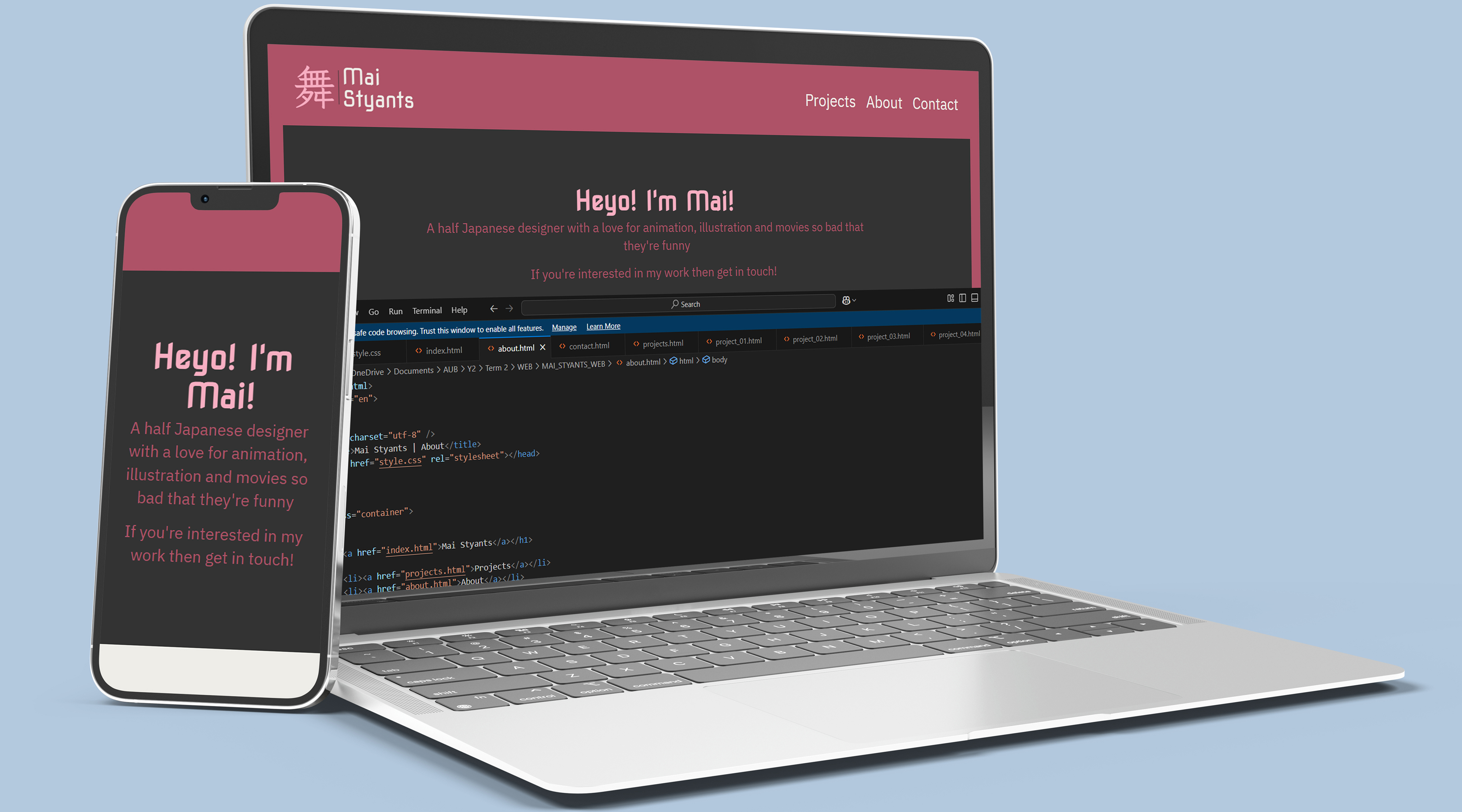
Website
Portfolio Website & Coding
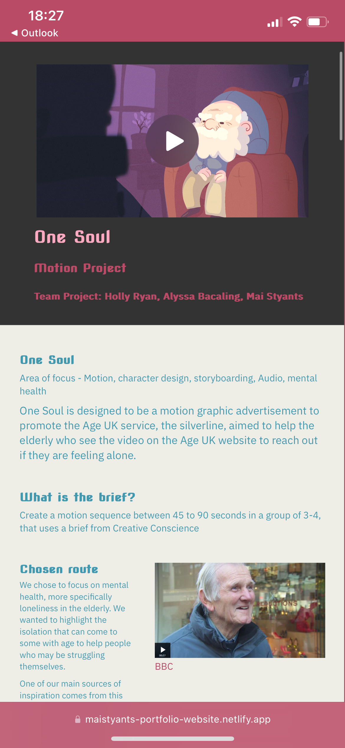
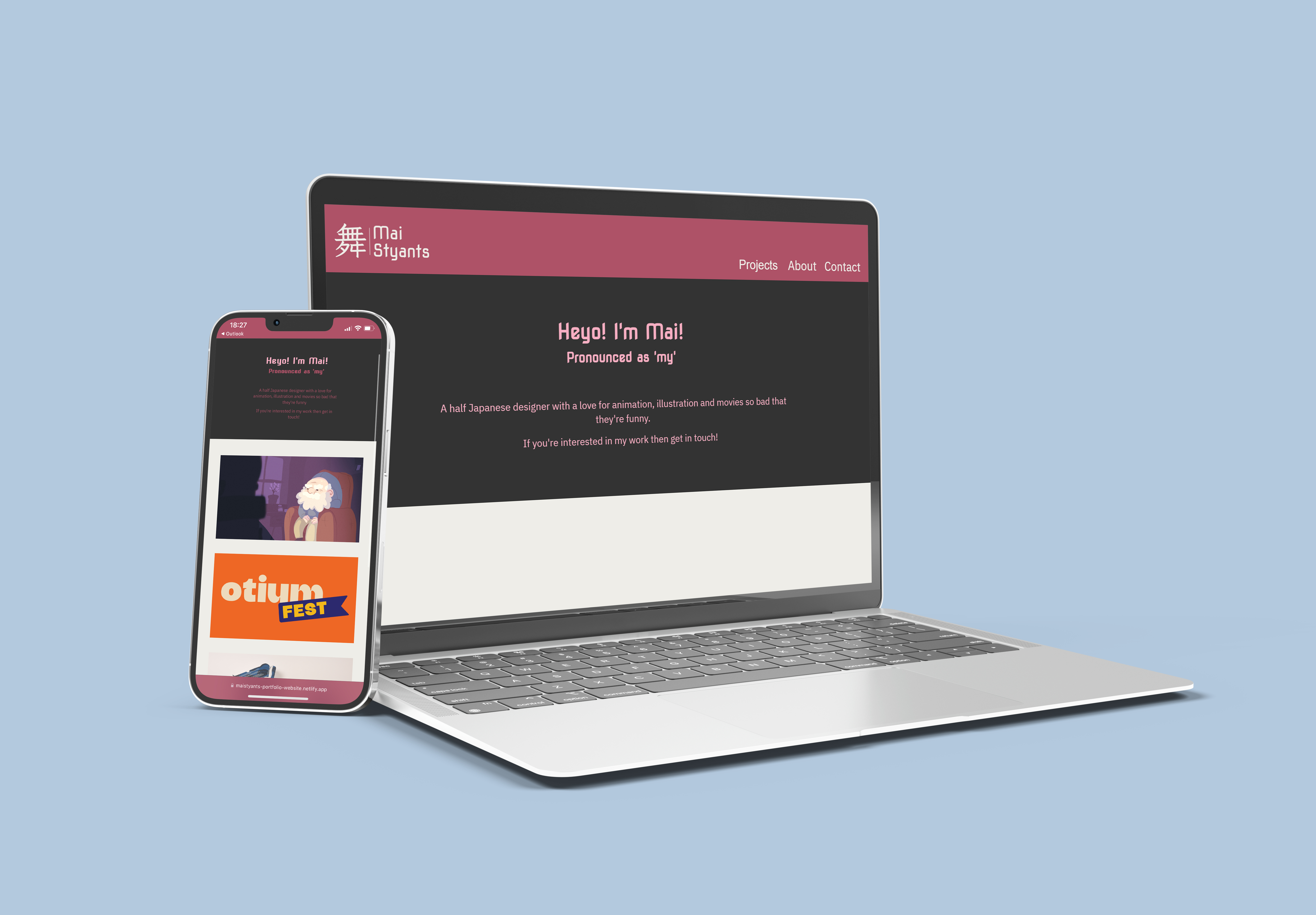
My Portfolio Website
Area of focus - Branding, UI/UX Design, CSS, Web Design, HTML
I coded this website portfolio using HTML and CSS. I designed this to be an online identity to be used when showing my work to potential employers.
What is the brief?
Design and code a portfolio website, while creating an interactive and interesting user experience tailored to potential employers and design companies.
Starting with Squarespace

I attended an online event hosted by AUB Futures called 'Mastering your Portfolio with Squarespace', a talk and Q&A with Tasha Dobe.
She gave a few tips on an 'About Me' page and what sorts of information we should be writing, as well as a few designing tips when it comes to layouts. She mentioned that repeating a part of your 'about me' onto your introduction on the 'home page' is often encouraged.
Battenhall
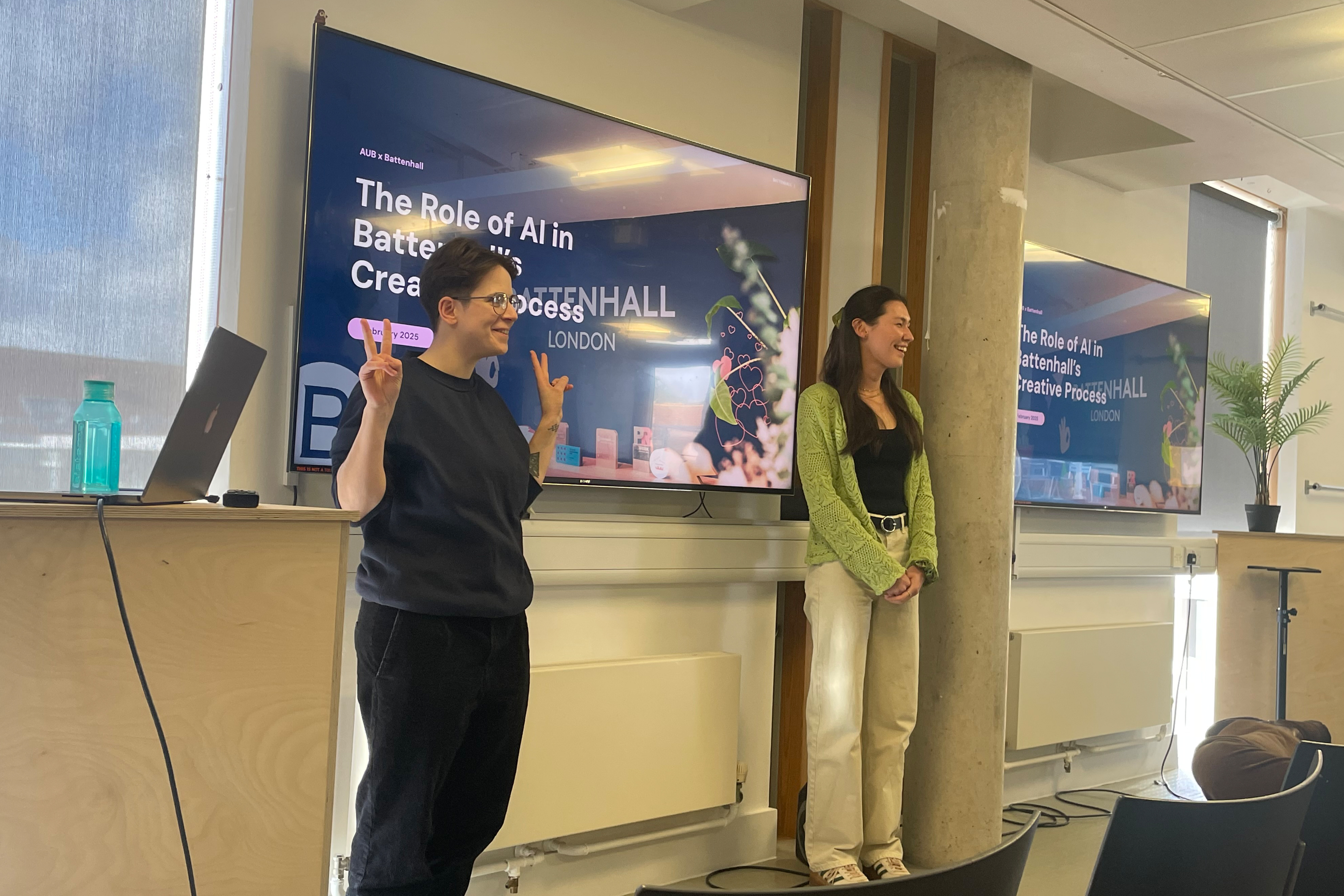
We had a visit and talk from some employees at Battenhall, who gave some insight into portfolios, and how to personalise them to us and what kind of jobs and design studios we are aiming for. If we are interested in a specific aspect of design, or are aiming to get into a specific company then we should tailor our portfolios to what they would be interested in, as well as do research into them for the interview.
Pentagram visit!
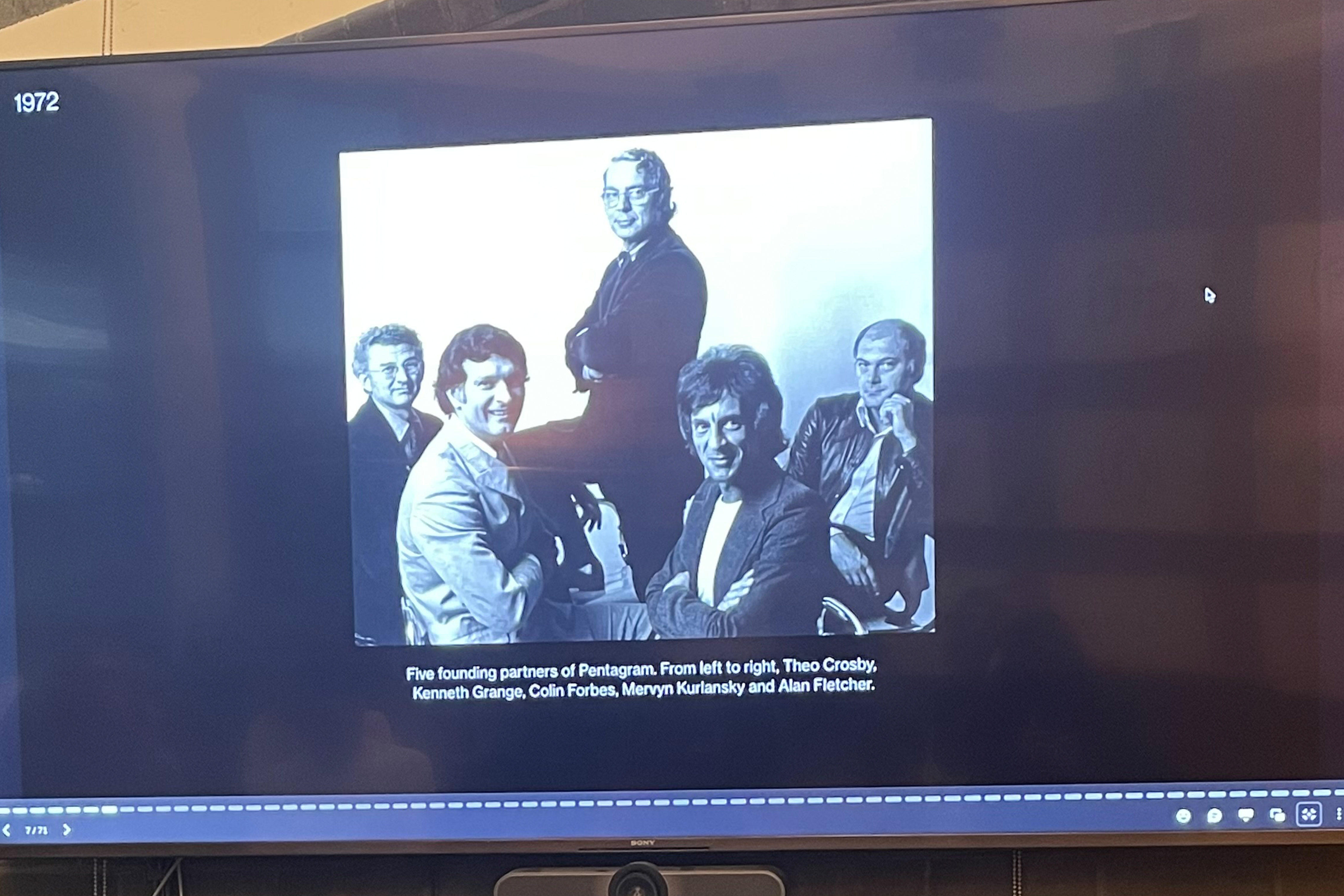
I had the honour of visiting the Pentagram office in London, where we got a presentation from Luke Powell, a partner at Pentagram, who answered some questions for us after his talk.
He informed us that we need to show a good understanding of the basics of Typography, as well as skills that are relevant to an employer, to prove that we can help them in their work, as that is a big part of being new in the professional design world.
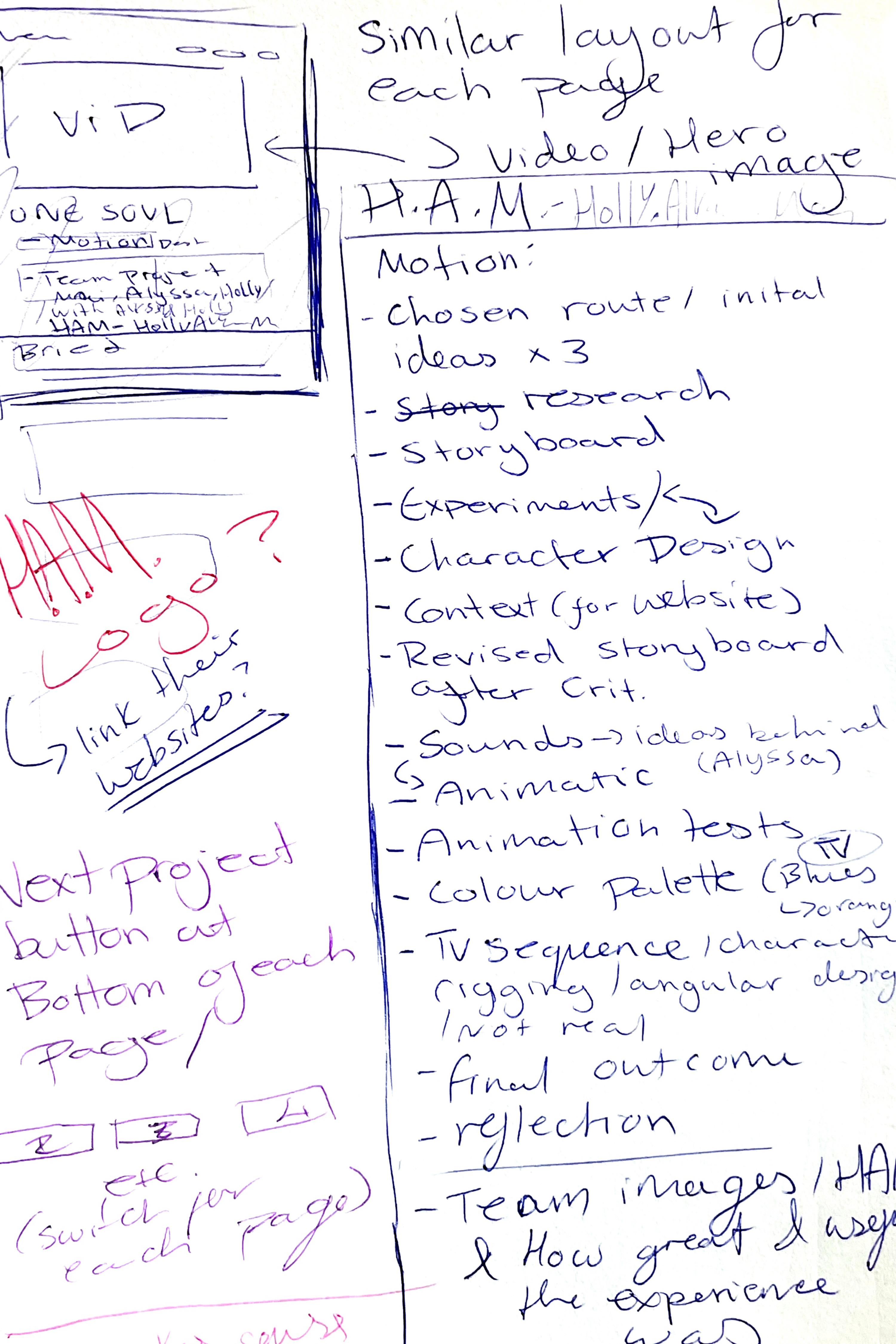
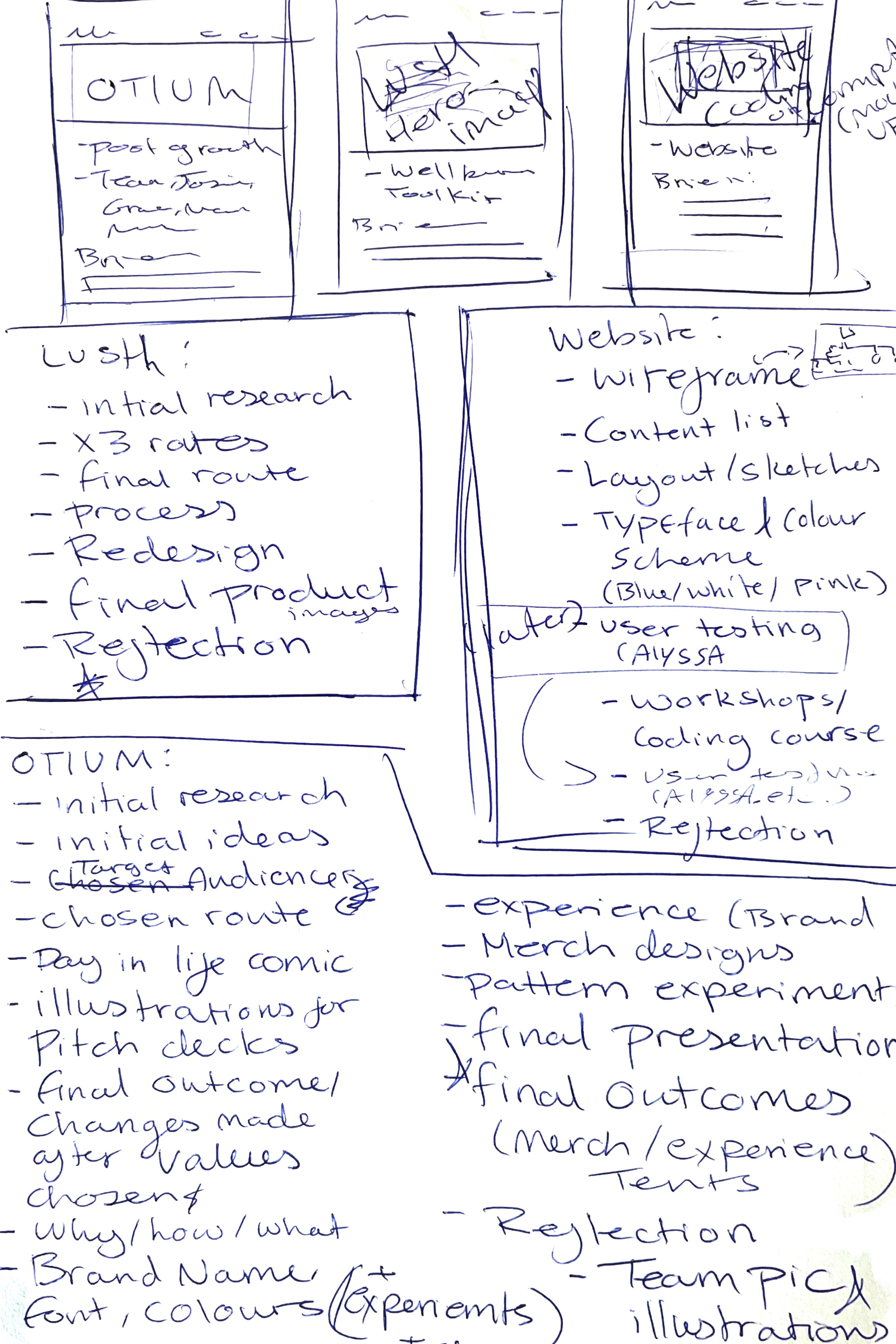
What's the structure?
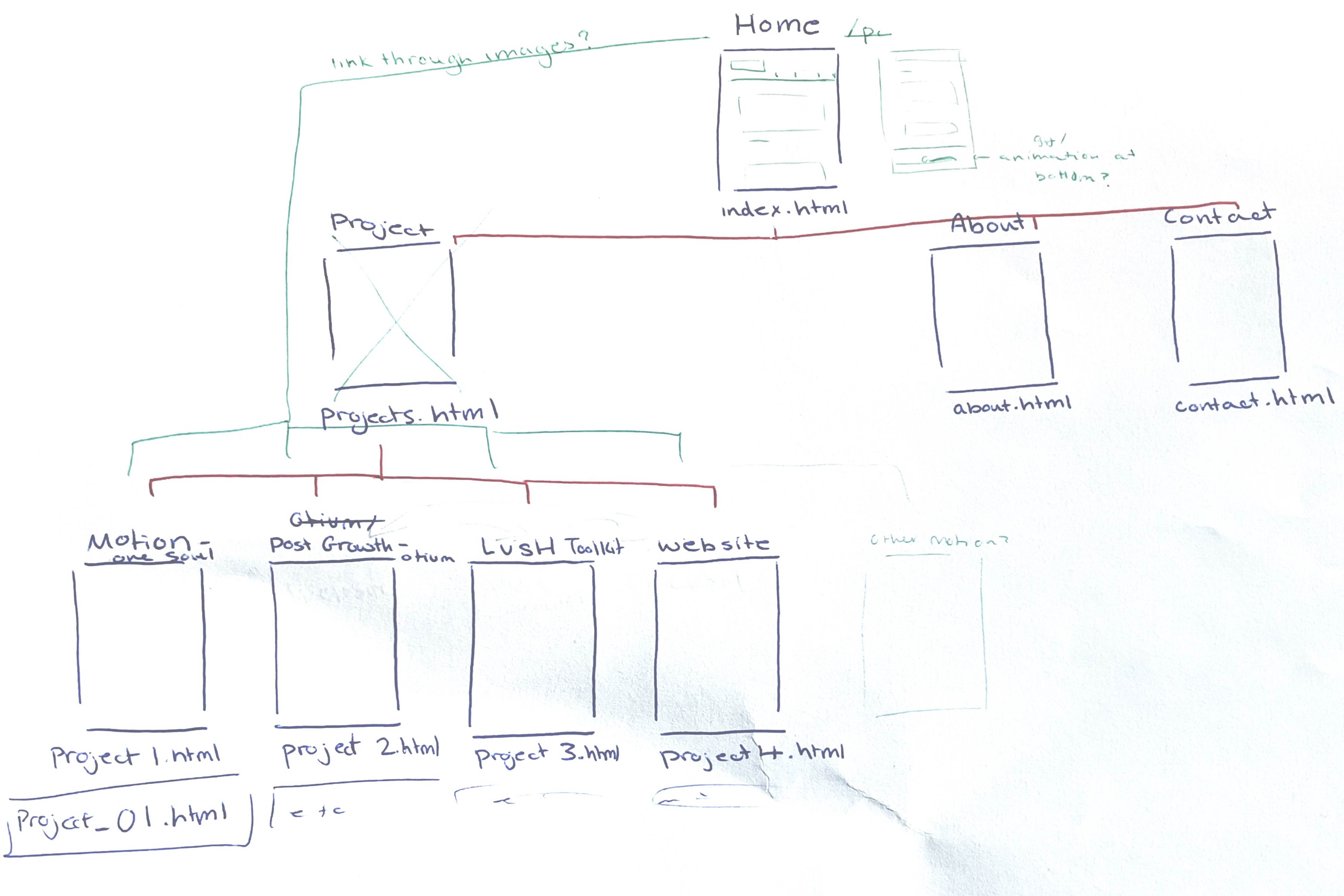
I started my website design with a wireframe, to plan out the structure of what pages would lead where.
I also started planning how I would link up my pages, and what the user would need to click inorder to reach their destination.
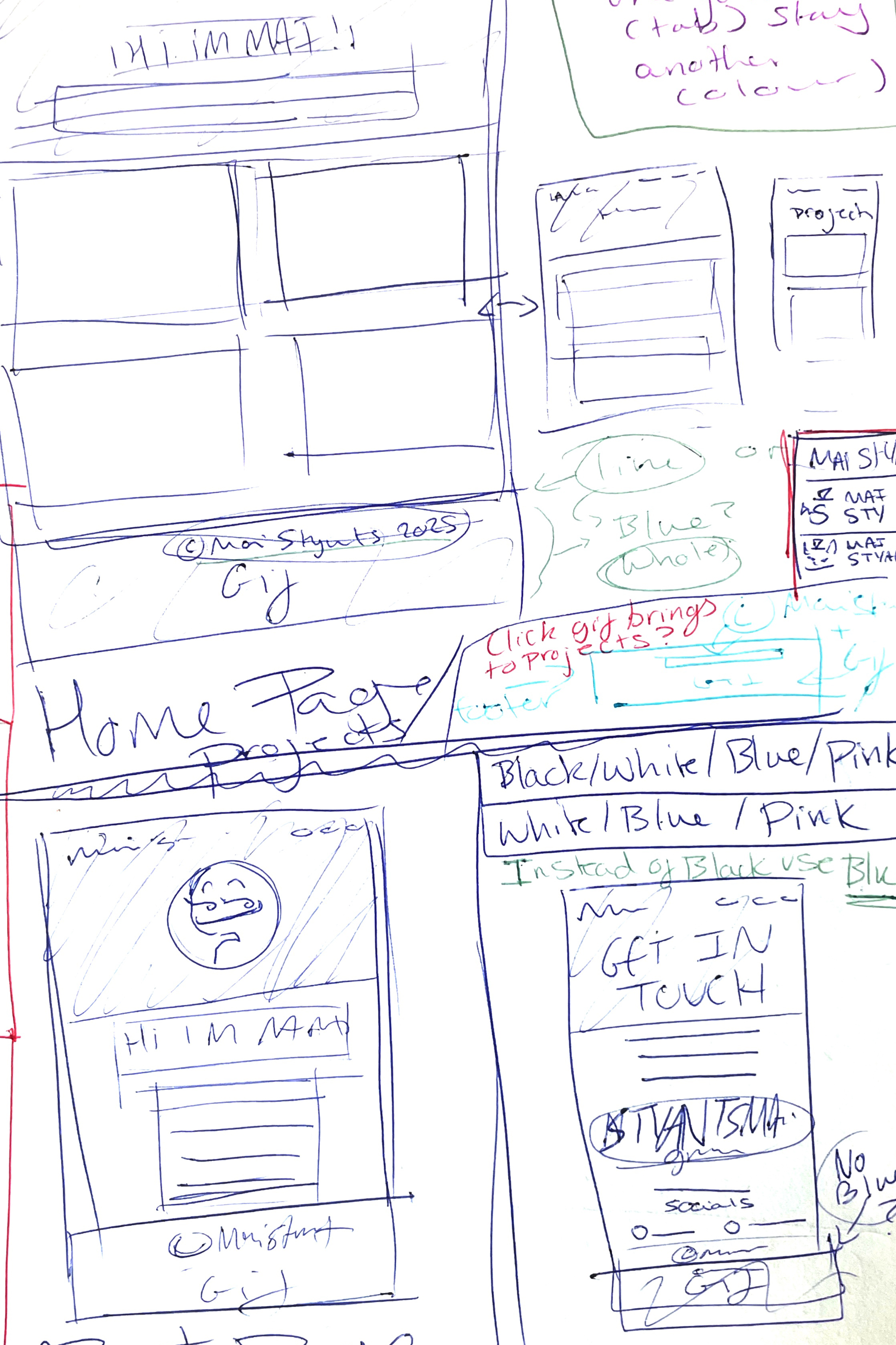
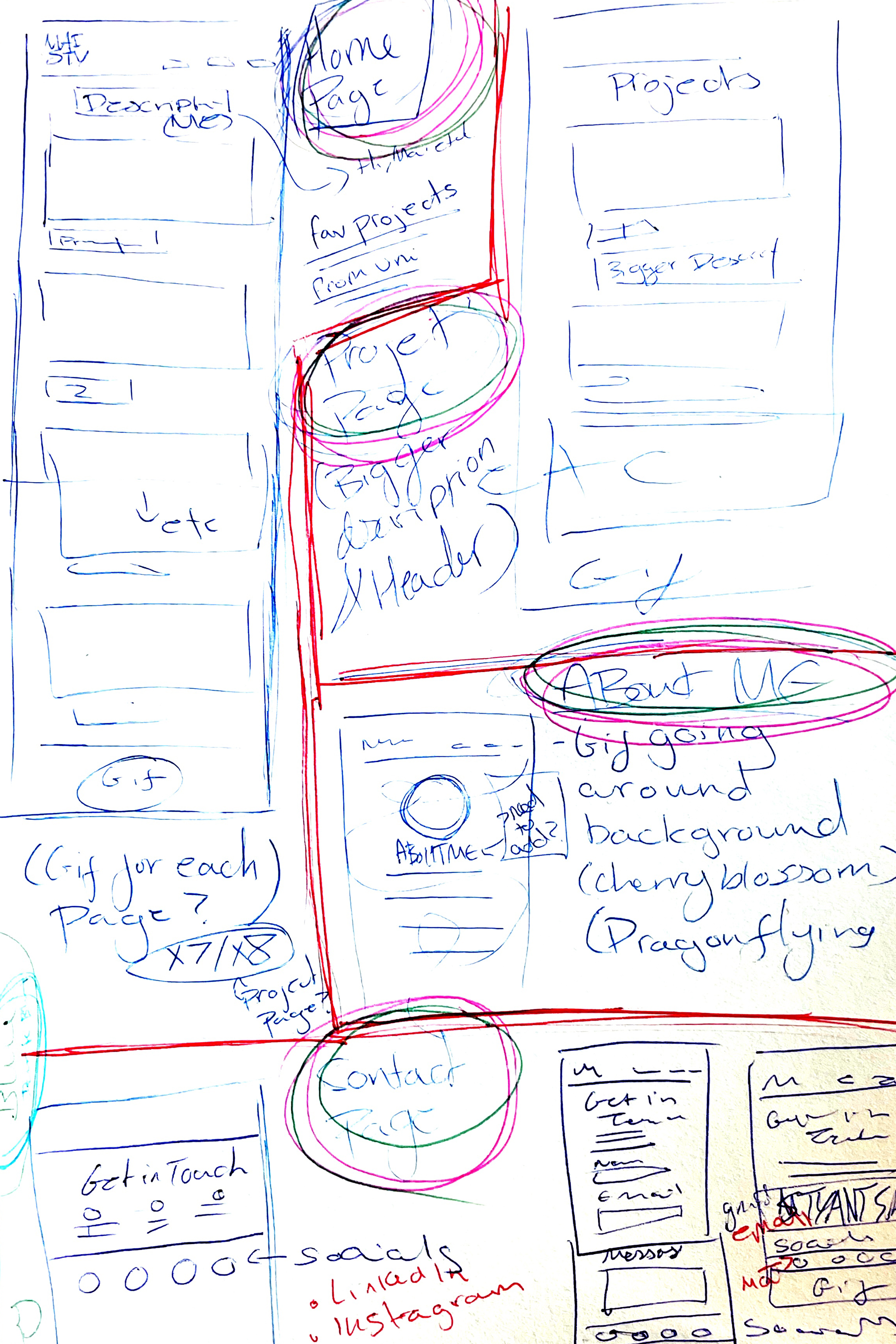
Sketching out my ideas
I created some rough initial sketches of design ideas, and jotted down any notes or thoughts that came to my mind for potential additions for my website.


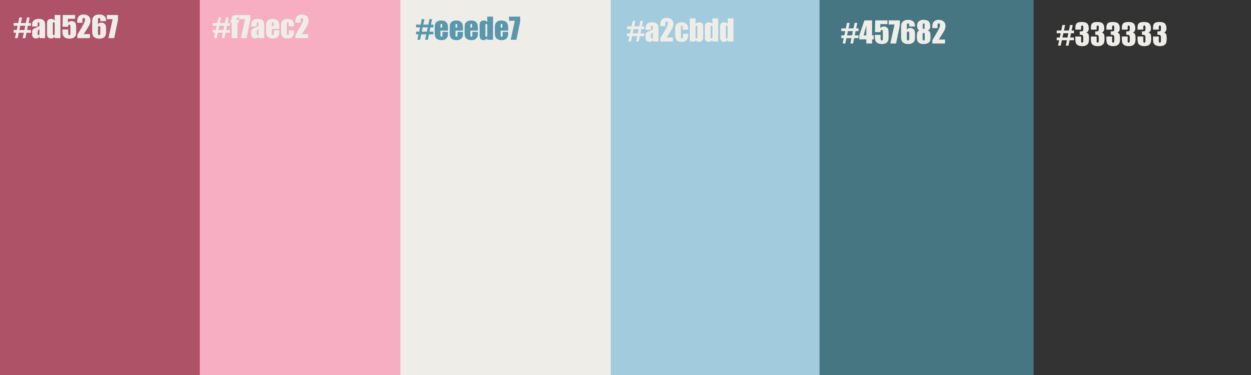
What colours represent me?
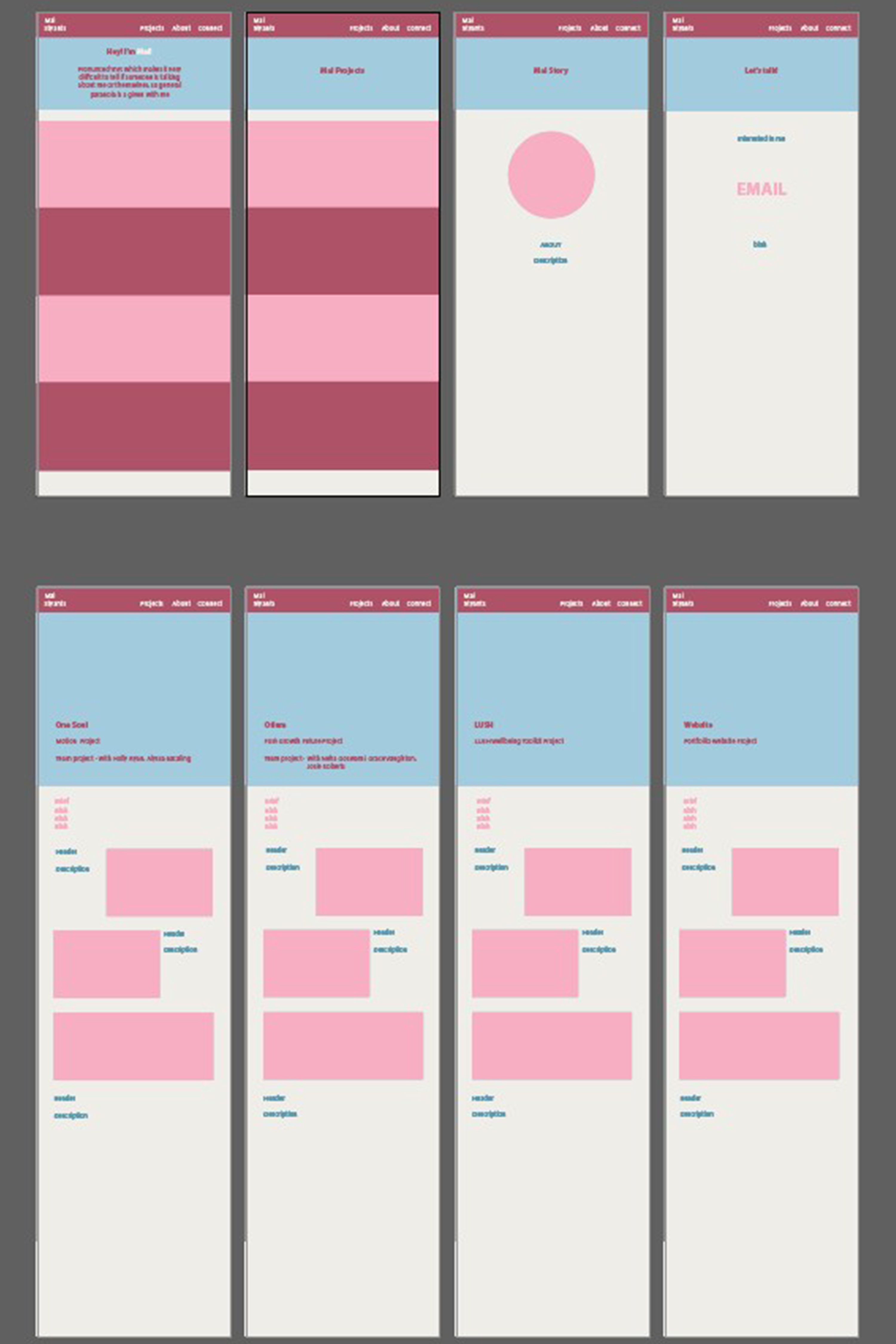
I tried a few different colour palettes mostly using pinks and blues as my base as I knew these were the colours I wanted from my branding. I ended up choosing a colour palette I felt would be versatile enough for what I had planned out while also looking nice.
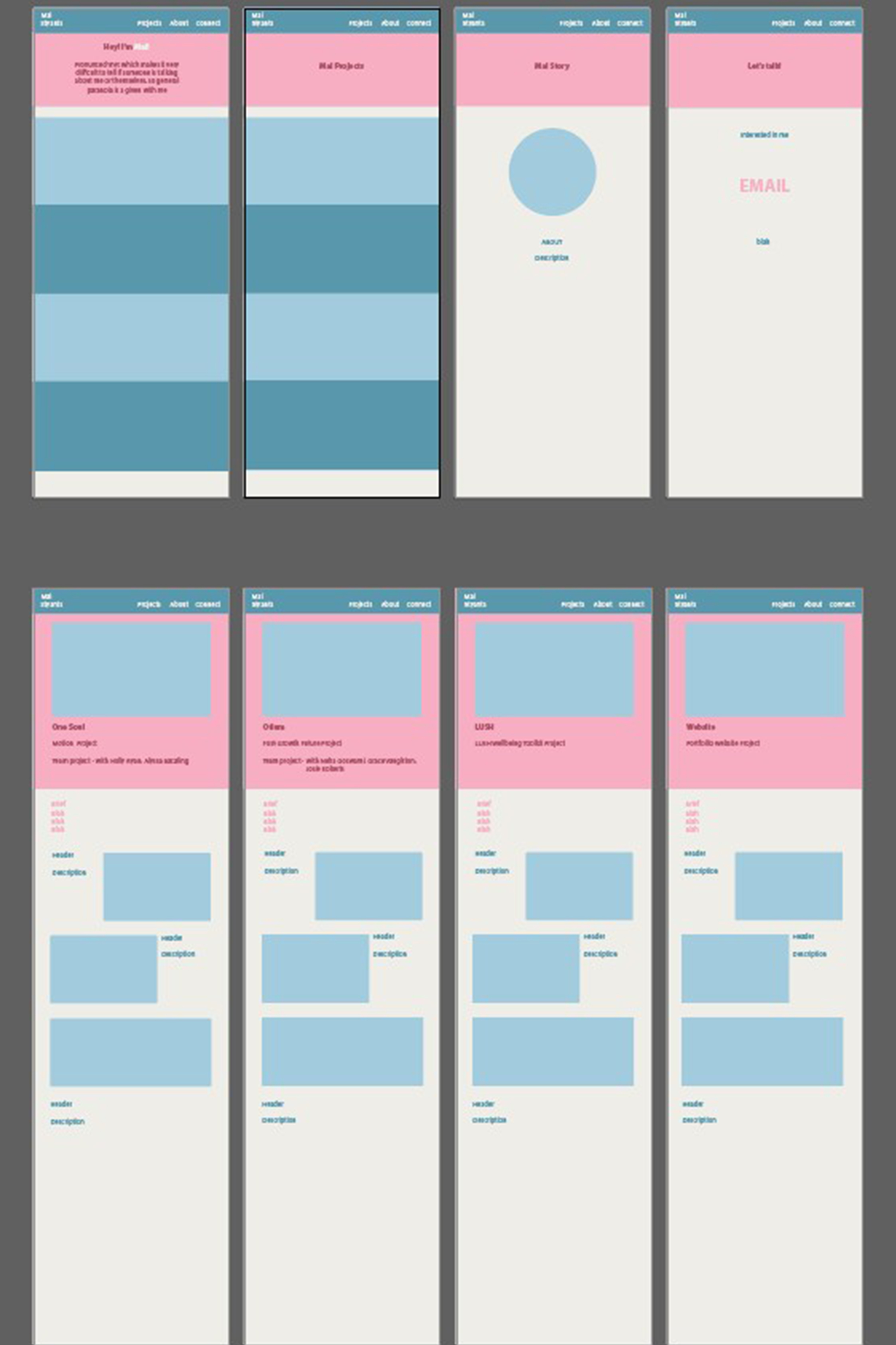
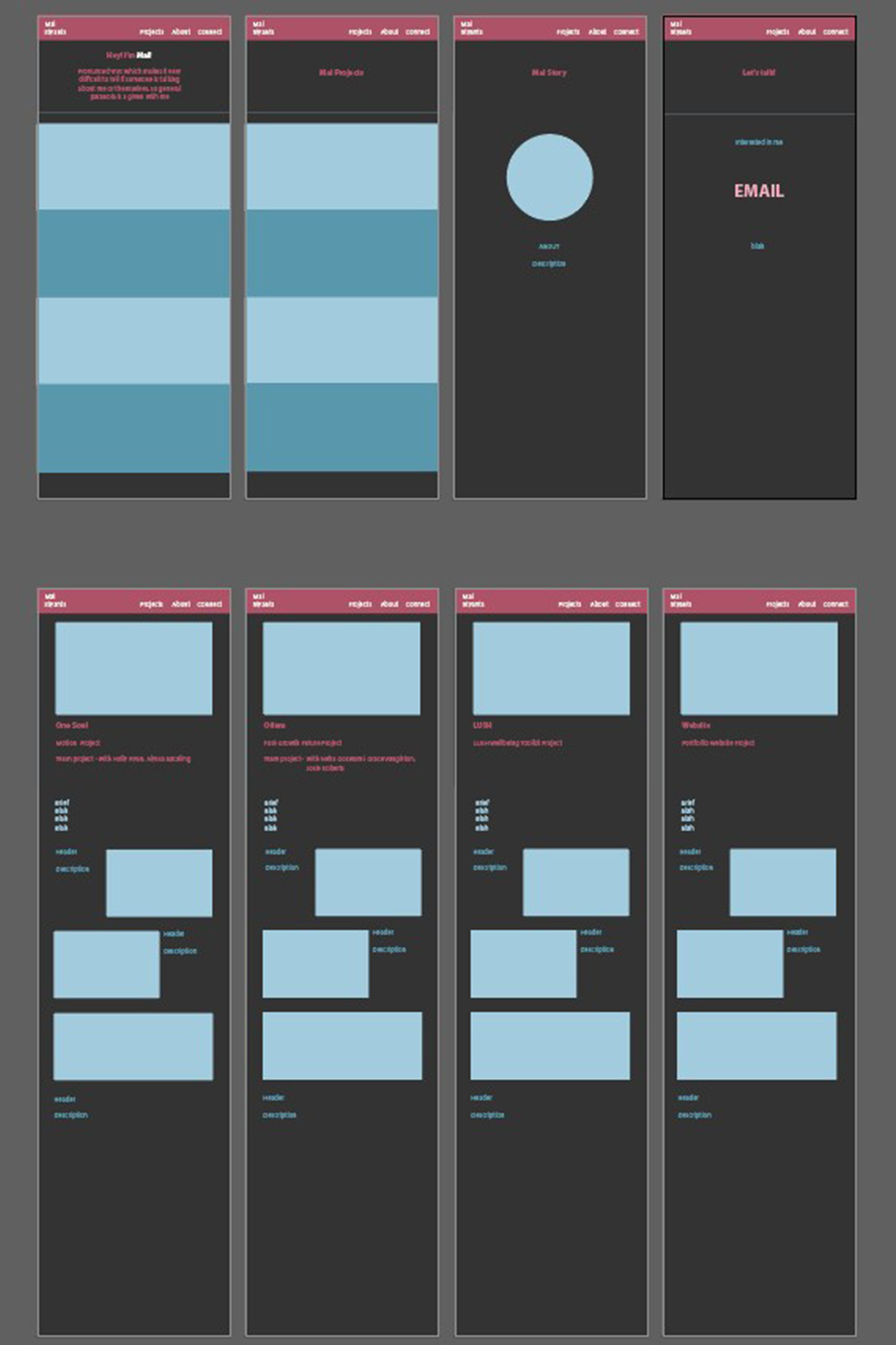
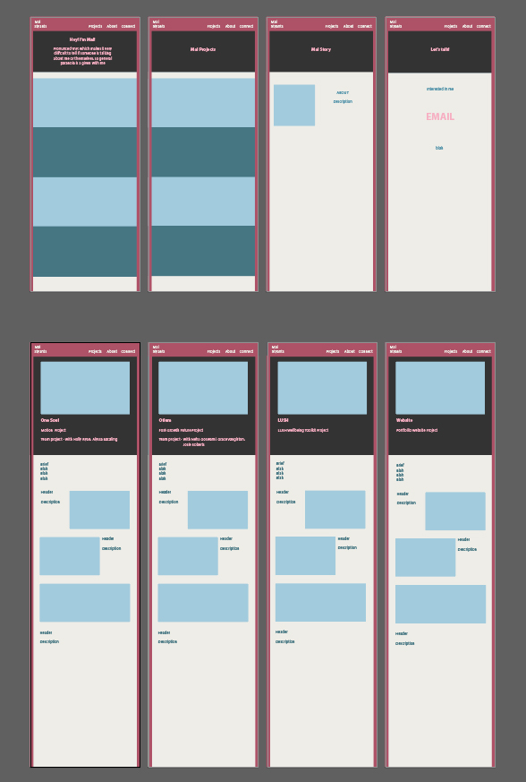
Prototyping my pages
To view how I could layout my designs and check how the colours would work together I made a basic layout in Illustrator and played around with the colouring in my chosen palette.
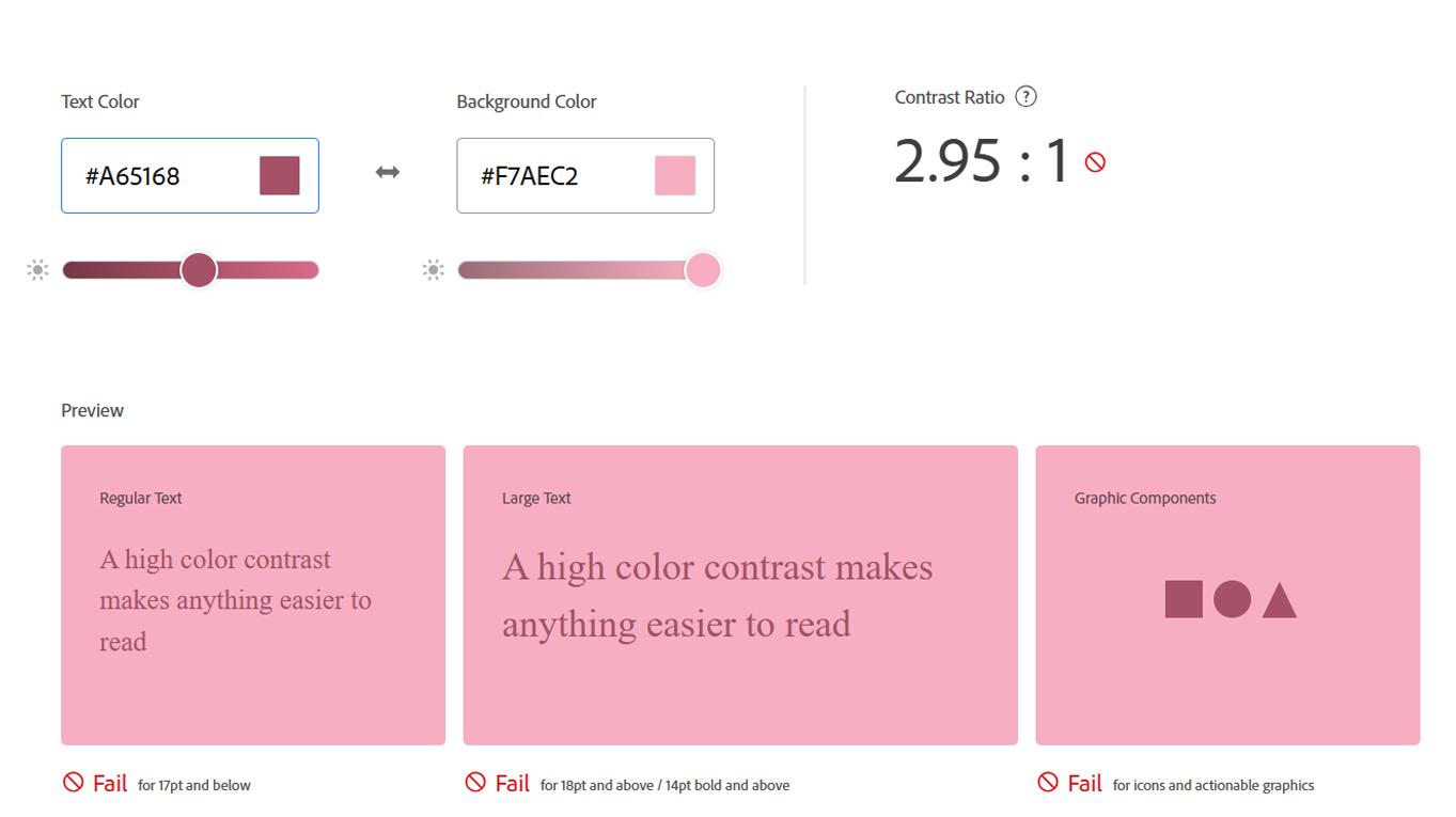
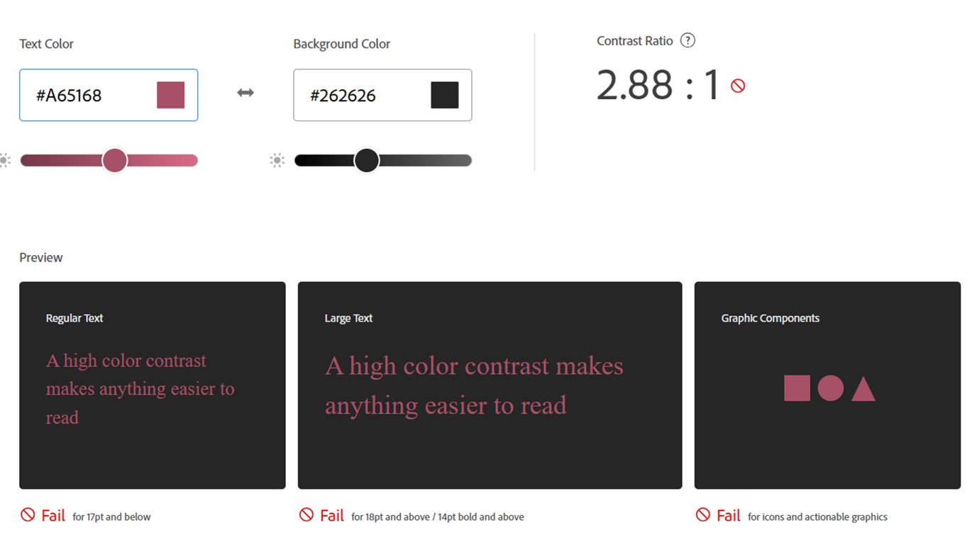
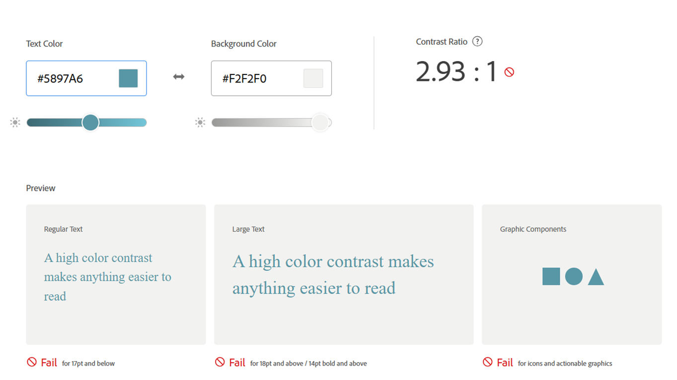
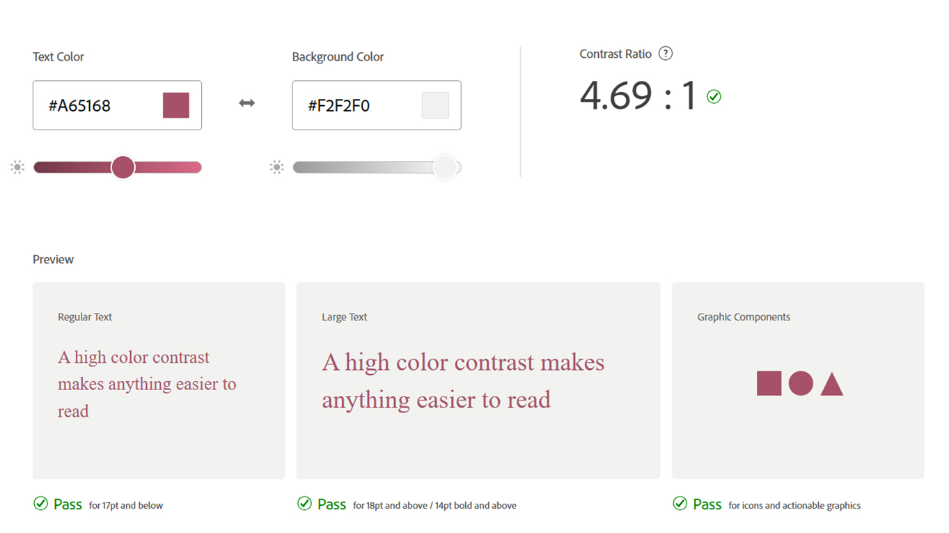
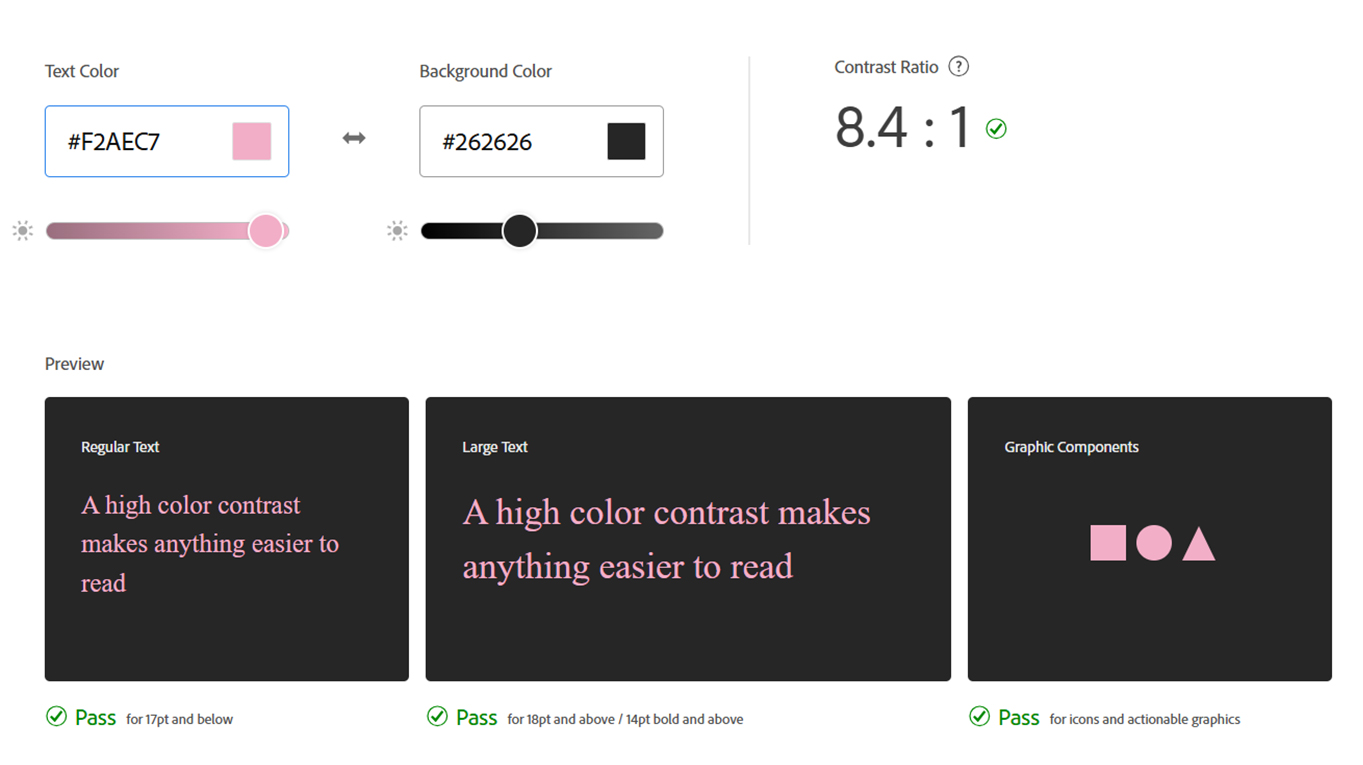
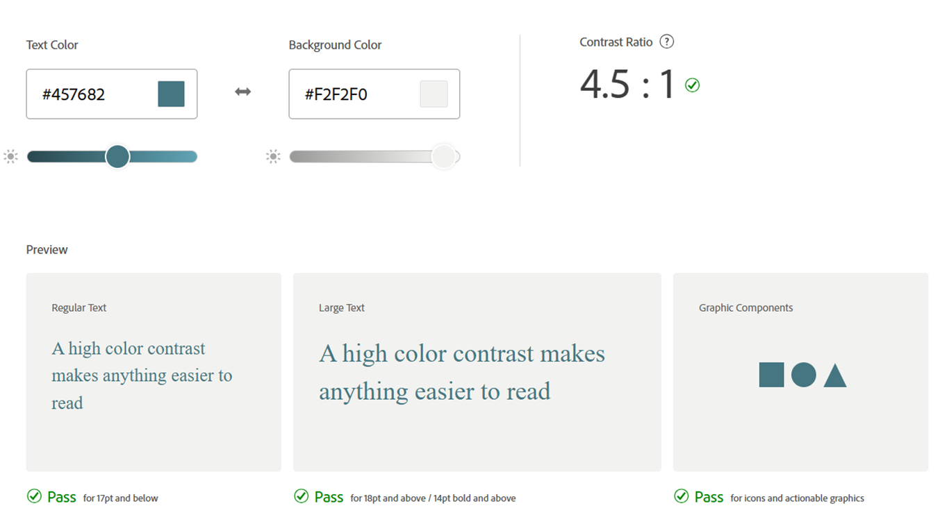
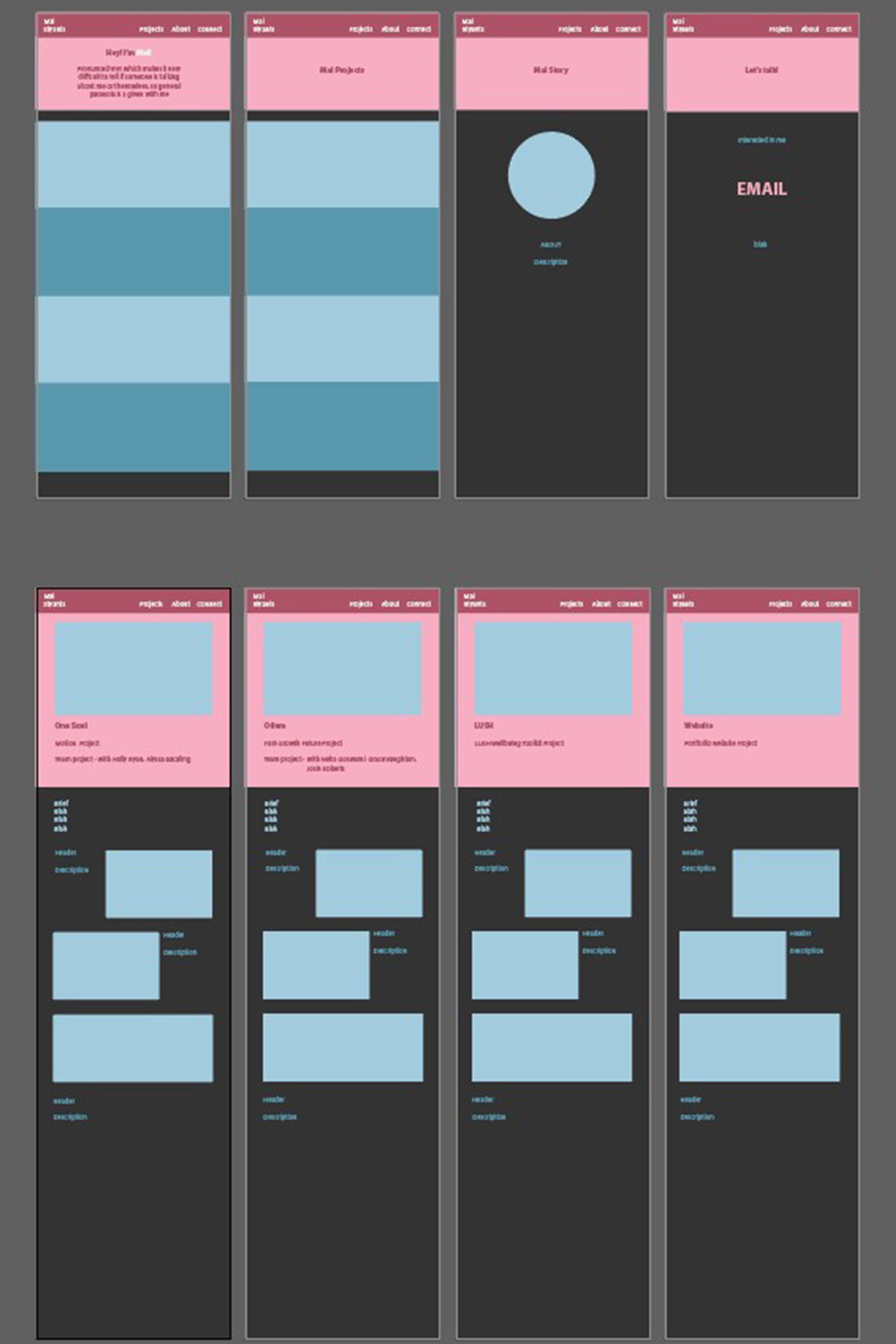
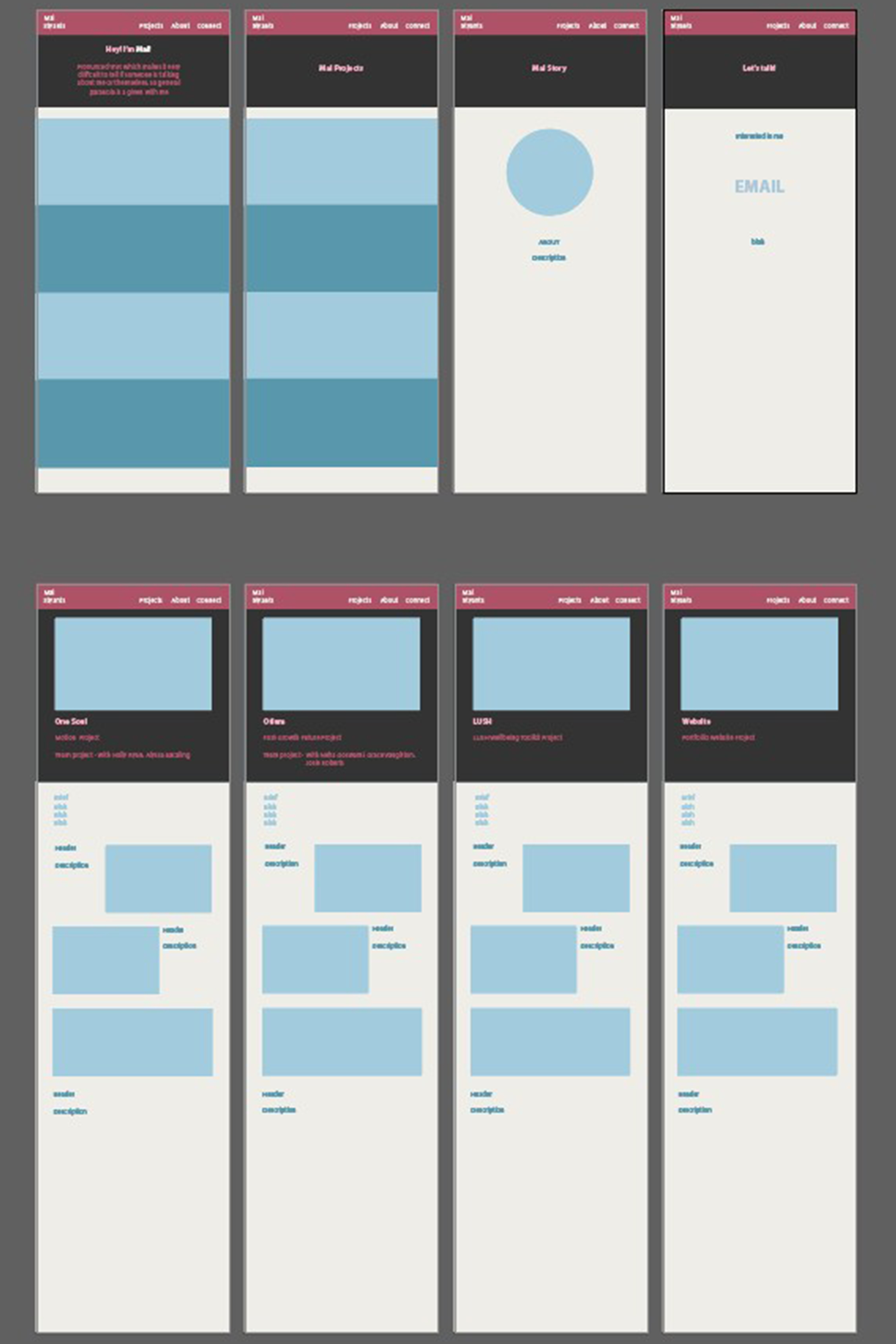
Revising my colour palette for accessability
The layout design I used had the colour palette I was interested in using, however I put them into adobe colours to see whether they would be easy to view and inclusive for people who could be colour blind, and I realised that some of the placements of colours would be hard to read so I tweaked some of the colour placements and tones.
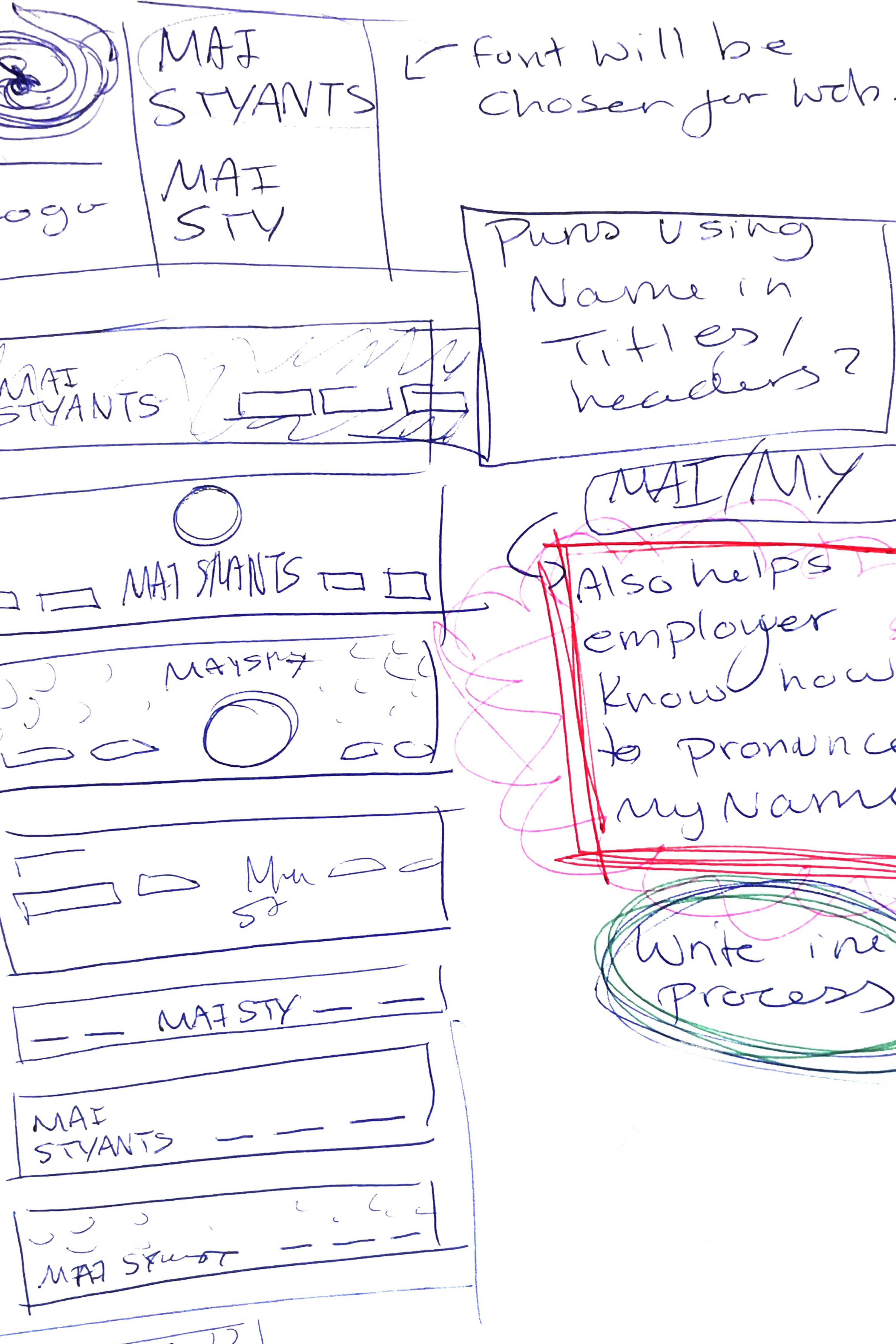
What's the best way to show myself in my work?
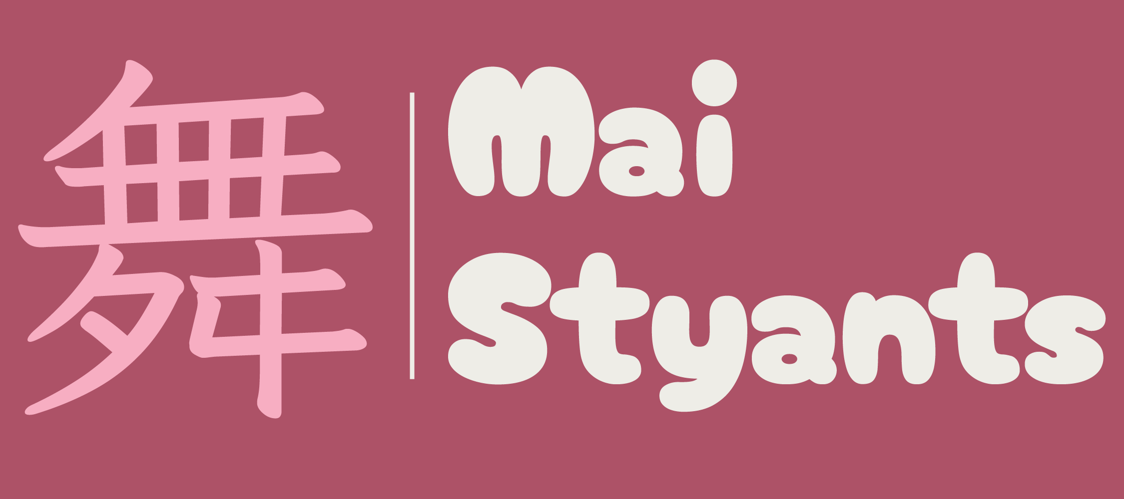
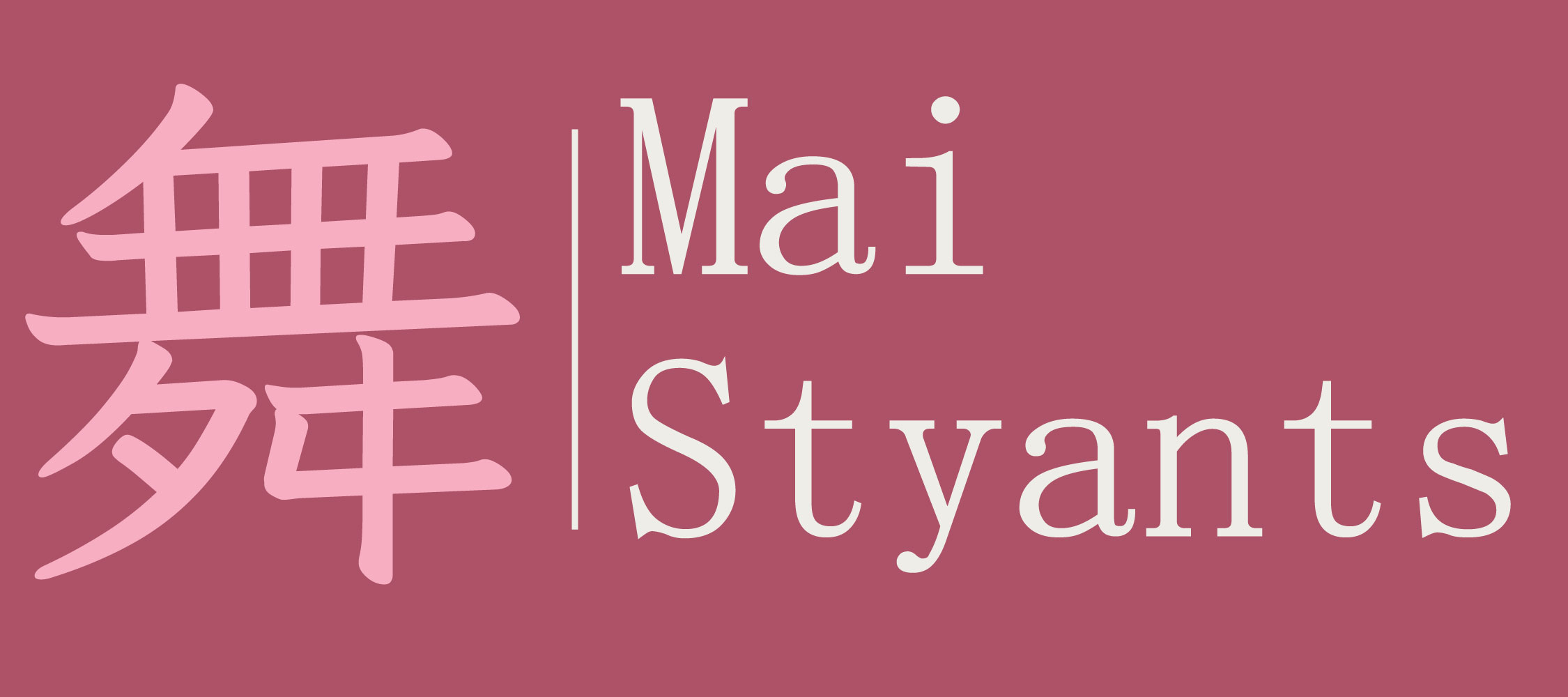
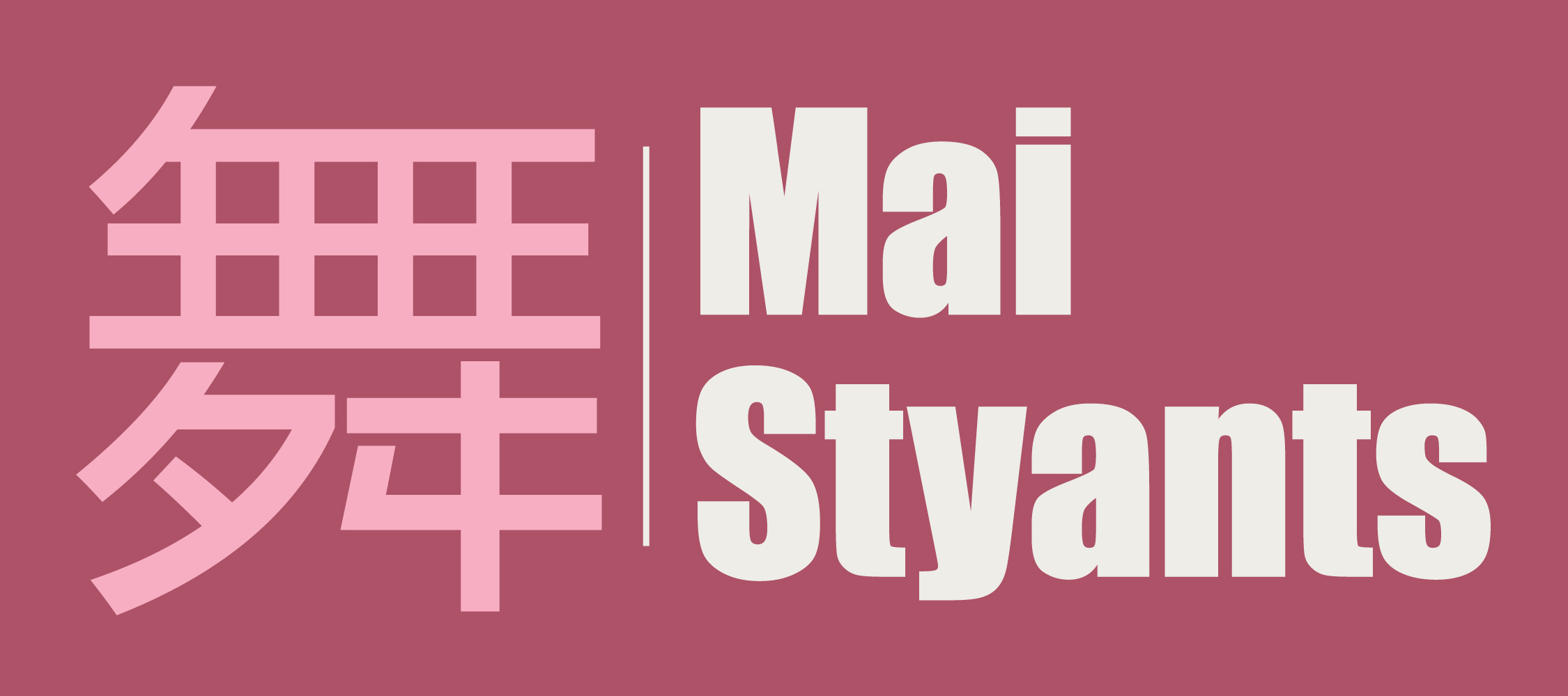
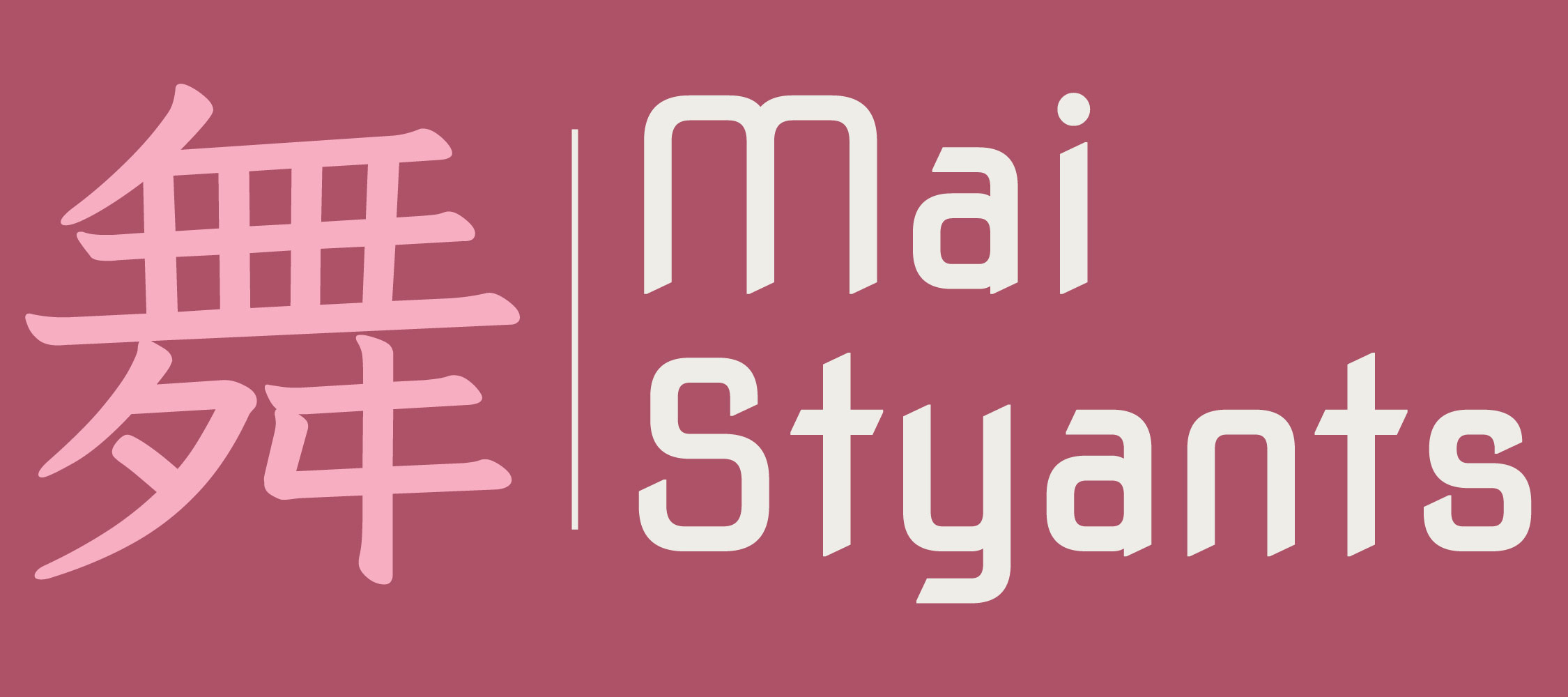
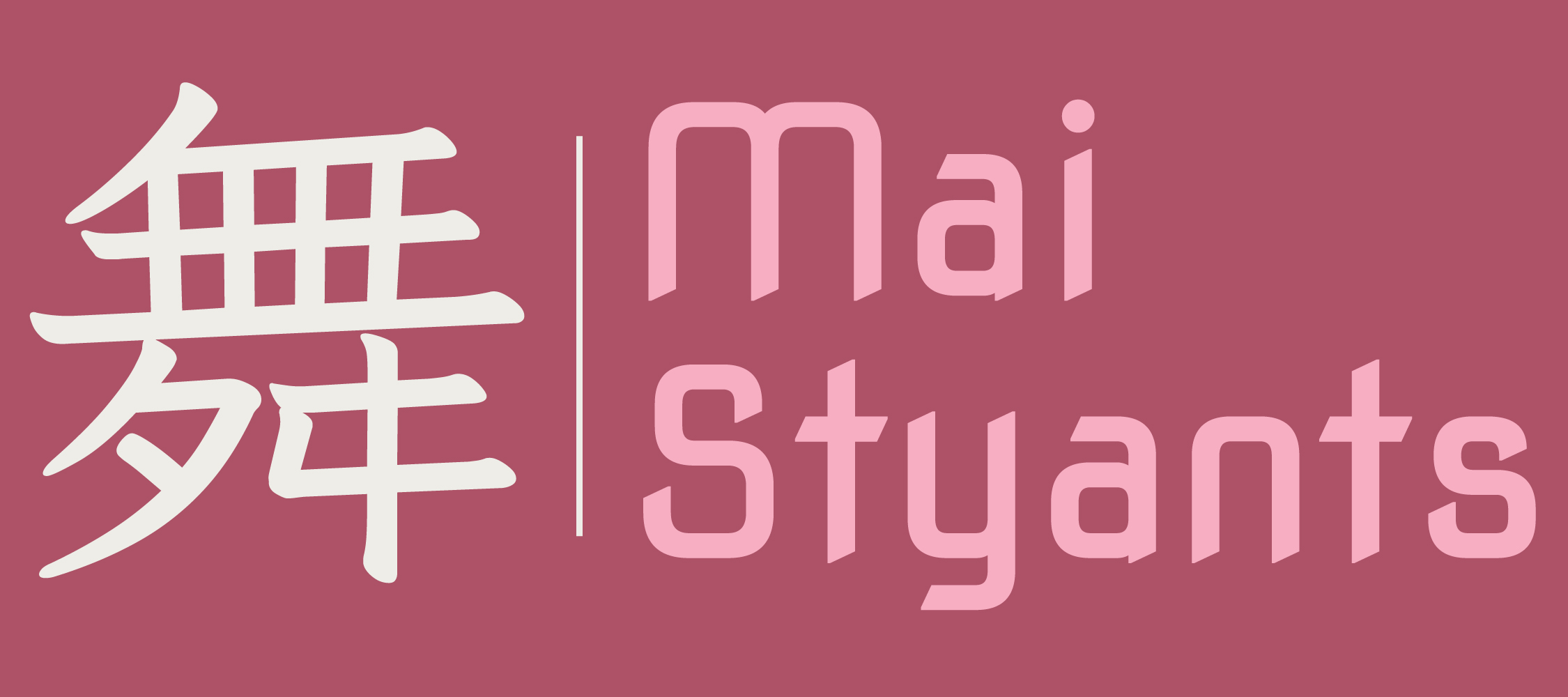
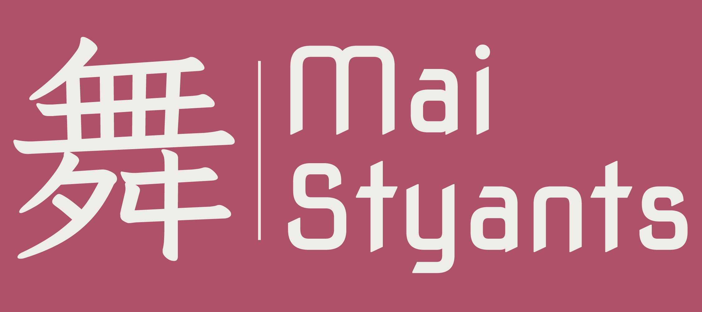
I tested a few different font styles and weights, as well as a few colour combinations. As I knew the background for this logo would be a dark pink I chose to use full white for my logo so It would show clearly.
I chose to use the 'poppins' font for my main text and the 'Nova-Square' font for my headers.
I also chose the 'iansui' font for the Japanese Kanji character I added into my website. The symbol means 'dance' and it's also the Kanji used for my Japanese name.
I used this Kanji symbol inside of a pink square as a favicon for my website, so it would show up as a little icon in the tabs at the top of your browser.

Time to code
We had workshops to learn coding, specifically CSS and HTML, which helped me to recap on coding and specifically how I would code my website, as well as change fonts, images and ensure my grid layouts would work. I also went over some online exercises from freecodecamp when I would be curious on how to write out certain code.
I also learned how to inspect code using the firefox developer tools, which has been useful in seeing how websites use code to layout their designs.
Is my website user friendly?
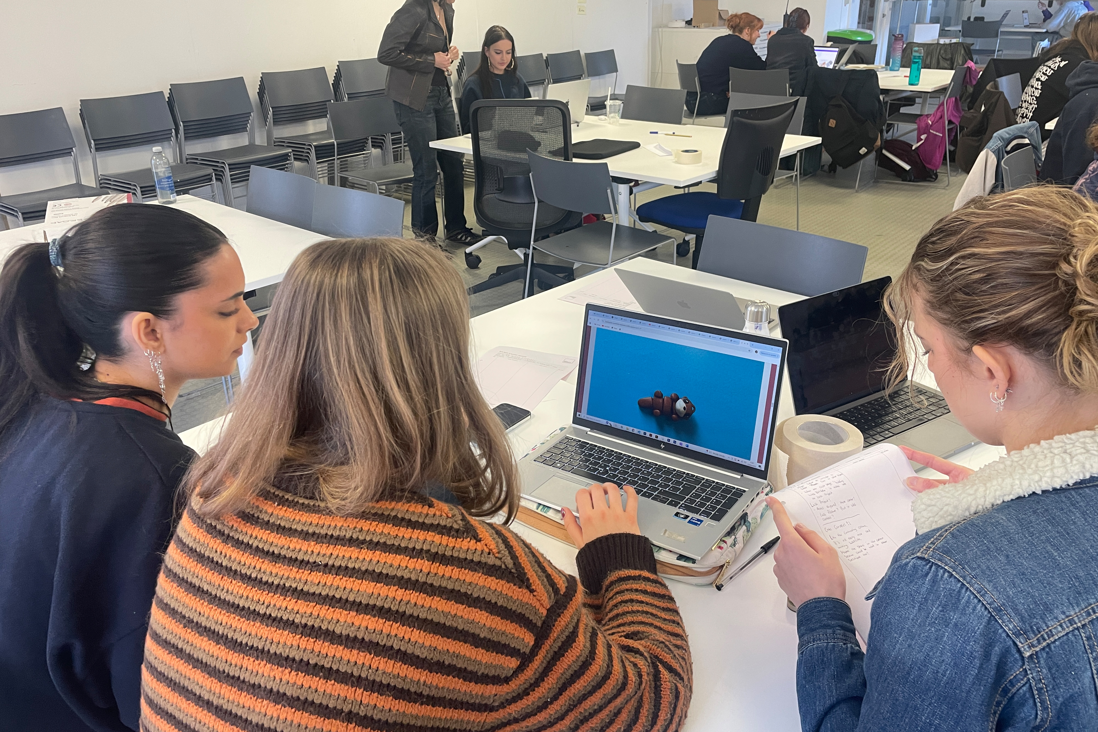
During my user testing I was advised on the styling and scale of some of my text, as well as a bunch of small details to improve my website, like adding a 'back to top' of page button, or making some images larger and some smaller.
Does my device work on other devices?
I also tested this website on some phones, while there was a slight issue with my 'about me' pictures on some phone devices, the website was in working order to be viewed on a smaller more vertical screen.
Reflecting on designing and coding a Website
To prepare for this project I went over freecodecamp to recap on coding, as I have done this before in a Computer Science and coding class a few years ago, but I didn't remember too much.
It was really fun to get back into coding, while also designing the website to be branded towards me and show my work, because even though I have coded a website before it was nothing like this project and was a lot more basic.
Occasionally my coding in the CSS style sheet would get a bit messy, especially with the grids and occasionally the colour boxes, however I managed to navigate my way through as I understood my own messy code, but if it were to be seen by anyone else it would probably take them a while to fully understand.
I really like the design I came up with, I really enjoy the colours and the use of my Kanji name as a logo as a way to put two ways of spelling my name in there. I'm also glad that I ended up changing the colour positioning after putting screenshots into adobe colour, as my website ended up looking all the better for it.
I do hope to do more web design, especially after this project as It was exciting to see my code turn into an actual website that is interactable, and it's incredibly satisfying knowing that I put in that work to get it to a point that I am happy with.